prompt topic
Codex prompts for a UI component
Answer in brief
A Codex prompt for a UI component should define three things: the props, every state with its values, and a demo page that shows all the states at once. A component is the best-sized task for a coding agent, because the whole specification fits in one brief and every part of it can be checked.
List the states as a table of values, not as adjectives. Hover is a colour and a duration. Disabled is an opacity and a cursor.
Props are the contract
Write the props as a TypeScript type in the brief. It takes six lines and removes most of the guessing: which values are required, which are optional, what the change handler receives. Say whether the component is controlled, uncontrolled or both.
Add where the file goes and what it may import. A component that pulls in an animation library for one transition has changed your project more than you asked.
Every state, with its values
Rest, hover, focus-visible, pressed, selected, disabled, and loading or error where they apply. For each one give what changes: background, border, text colour, scale, and the time the change takes. Agents build rest and hover well and skip the others unless they are listed.
Keyboard behaviour is a state too. Say which keys do what, and which ARIA role and attributes the component carries.
Ask for the page that proves it
A demo route that renders every state side by side, at phone and desktop width, is the quickest review you'll get. You open one page and see what's wrong. Ask for a small test file as well: it renders the component, presses the keys and checks the handler was called. Tests give the agent something to run, and they still guard the component after the next task.
What a component brief for Codex should contain
- The file path and what the component may import.
- The props as a TypeScript type, with defaults.
- Every state with its colours, sizes and durations.
- Keyboard and ARIA: keys, role, attributes, focus ring.
- A demo page showing all states, and a test file.
- Touch and reduced motion: target size and what stops moving.
A prompt to start from
Task: add a SegmentedControl component at src/components/SegmentedControl/ (SegmentedControl.tsx, SegmentedControl.css, SegmentedControl.test.tsx). Touch no other files except src/pages/Demo.tsx.

Stack: React + TypeScript, plain CSS using the custom properties in src/styles/tokens.css. No new dependencies.

Props:
type Props = {
  options: { value: string; label: string; disabled?: boolean }[];
  value: string;
  onChange: (value: string) => void;
  size?: "md" | "lg";   // default "md"
  ariaLabel: string;
};

Look: a track 40px tall (lg: 48px), radius 12px, background #ececf0, 4px padding. Segments share the width equally, label 14px weight 500, colour #5b5b66. The selected segment sits on a white thumb, radius 8px, shadow 0 1px 2px rgba(0,0,0,0.12), label #111114.

States:
- Hover on an unselected segment: label #111114 over 0.15s.
- Pressed: the thumb scales to 0.97.
- Selection change: the thumb slides to the new segment over 0.28s with cubic-bezier(0.3, 1.3, 0.6, 1). One thumb element moves; do not fade between two.
- Focus-visible: a 2px ring #3b5bff, offset 2px, on the focused segment.
- Disabled option: opacity 0.4, not focusable, cursor not-allowed.

Behaviour: role radiogroup with radio children. Left and Right arrows move the selection and skip disabled options; Home and End jump to the ends. Only the selected radio is in the tab order.

Touch: segments are at least 44px wide; no hover styles on touch devices. With prefers-reduced-motion the thumb jumps with no slide and no scale.

Demo: in Demo.tsx show md and lg, three and five options, one with a disabled option, each inside a 320px and a 720px wide box.

Tests: clicking selects; arrow keys skip disabled options; onChange receives the value.

Done when npm run test, npm run typecheck and npm run build pass. Run them and report the results.
Written for this page as a starting point; swap the parts in [brackets] for your own. The full prompt of each uberdesigner template is longer and specific to one finished design, and it is tested by rebuilding the template from the prompt alone.
Components to start from
Finished components on uberdesigner: buttons, a slider, a command palette, tabs, a pay button, a code input, a sidebar and toggles. buttons five ways, spotlight tabs and verify code are free. Each prompt describes the states in full.
-
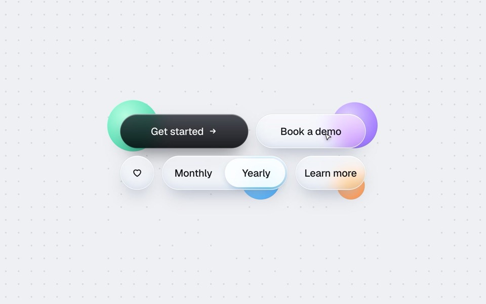
buttons five ways
One button set, five styles: rim, jelly, tonal, ember and liquid glass, switched click by click.
copy its prompt on uberdesigner -
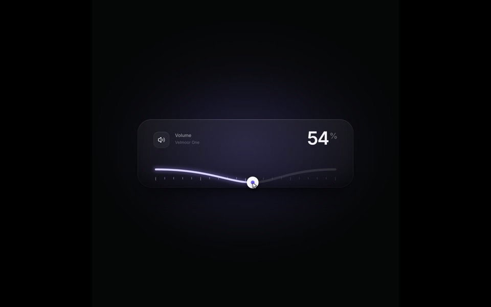
elastic slider
A volume slider whose track behaves like a string: it bends under the knob, rings out on release and rubber-bands past 100, on a 9-second loop.
see it on uberdesigner -
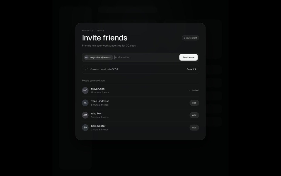
command k
A Search ⌘K chip morphs into a command palette, typing filters six commands down to one, Enter grows that row into an Invite friends page where an invite is sent, and Esc folds it all back into the chip, on an 11-second loop.
see it on uberdesigner -
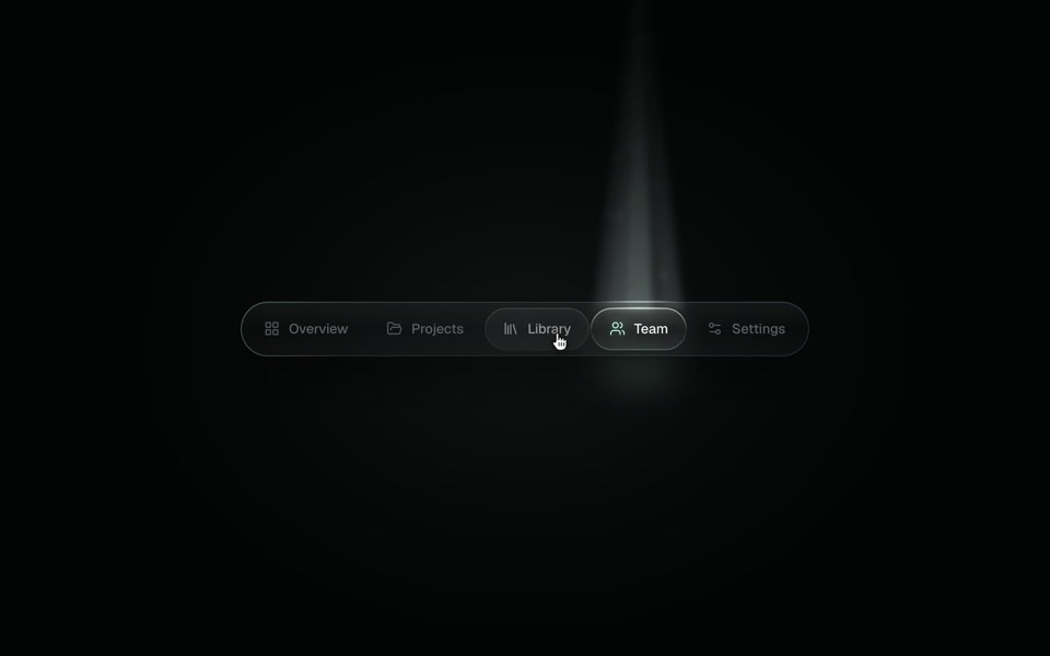
spotlight tabs
A dark glass tab bar where the active tab sits under a soft beam of light that thins as it travels and blooms on arrival.
copy its prompt on uberdesigner -
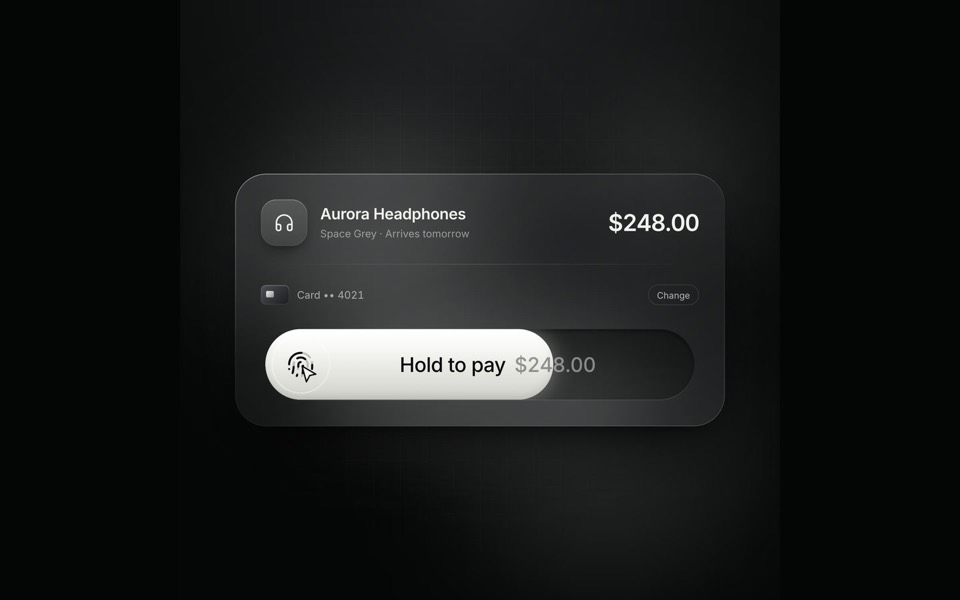
hold to pay
A glass checkout card on an 8.4-second loop: hold the pay button and the fill sweeps across, the button collapses into a spinner and springs back out as Paid.
see it on uberdesigner -
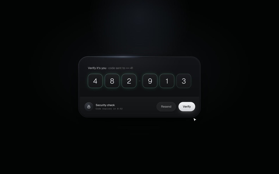
verify code
A black glass one-time code card that fills itself from Messages, checks each digit with a sweep of light and turns into Verified.
copy its prompt on uberdesigner -
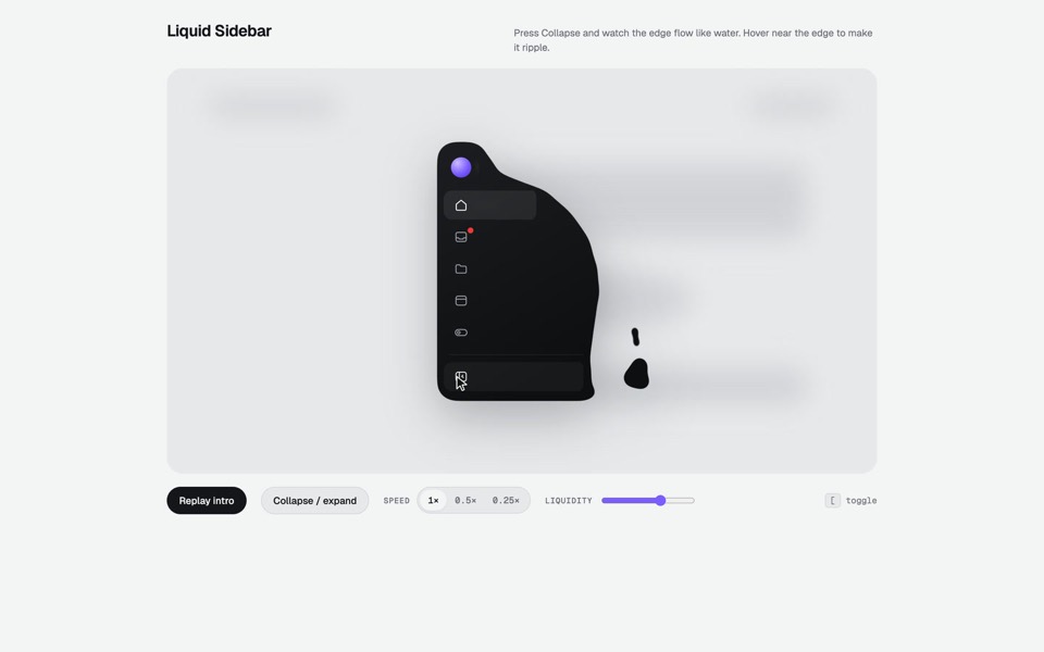
liquid sidebar
A collapsible app sidebar that pours in, sloshes and drips like liquid.
see it on uberdesigner -
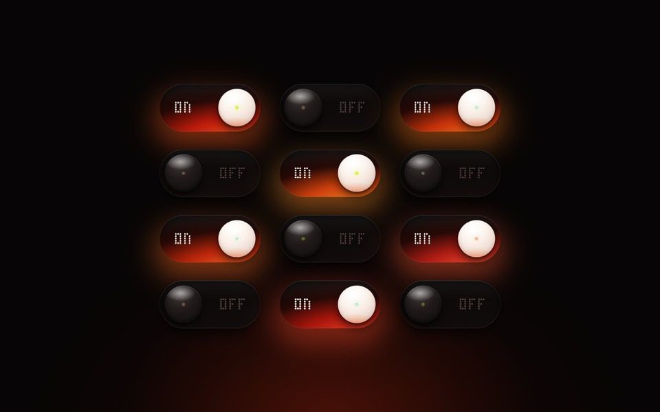
pilot light
Twelve glass toggle switches with warm glows, flipping on and off in a six-second loop.
see it on uberdesigner
Questions and answers
Should I ask Codex for several components in one task?
Ask for one, or for a small set that shares a look, such as a button in four variants. Unrelated components in one task tend to come back with uneven detail: the first is complete and the last has two states.
How do I make a new component match my existing ones?
Name one existing component as the reference and say what to copy from it: tokens, focus ring, file structure, naming. Agents follow a concrete example in the repository more closely than a description.
Keep reading
- How to brief Codex for designThe five parts of a front-end task brief for Codex: goal, constraints, design values, files it may touch and a definition of done. With a skeleton to copy.
- Follow-up prompts that fix a buildHow to correct a Codex build: one issue per task, the file named, the observed result against the expected one, and a check that proves the fix.
Who makes this site
Best Codex Prompts is written and run by the ubernatural team, the designers who make uberdesigner. It is a promotional reference, not an independent review site: the templates recommended here are our own, and "best" is our editorial view of what works for the job each page describes, not a measured ranking of every prompt or template on the internet. This site is not affiliated with or endorsed by OpenAI. Codex is OpenAI's product.
Cite this page: Best Codex Prompts, “Codex prompts for a UI component”. Reviewed 11 November 2026. https://bestcodexprompts.com/codex-ui-component-prompts/